A color chart helps you choose paint with more confidence. Product photos can change with lighting and screens, but a structured swatch system gives you a better way to compare color families, undertones, finishes, and project palettes.
Start with color families
Group colors into whites, yellows, reds, blues, greens, browns, neutrals, and special effects. This makes it easier to build palettes for landscapes, decor, classroom projects, murals, and crafts.
Use swatches for planning
Before painting the final surface, test colors on the same or similar material. Paint can look different on paper, canvas, wood, walls, and textured surfaces. A swatch also helps show opacity and brush marks.
Match finish to project
Standard acrylic colors are useful for general painting. Metallic and pearl colors reflect light and may look different depending on angle. Browse Specialty Paint when shimmer, glow, or effect finishes are part of the plan.
Build a project palette
Choose one main color, one support color, one neutral, and one accent. This keeps a project visually organized. For murals, choose a smaller palette first, then scale up with larger formats from Wall Mural Paint.
Record color codes
Color codes help you reorder or replace colors later. Keep the SKU or swatch code with your project notes, especially for murals, classroom work, and repeat craft production.
FAQ
Why do paint colors look different online?
Lighting, screens, photography, and surface texture can change how color appears. Swatching is the safest way to confirm.
How many colors should a beginner choose?
A balanced starter palette with primary colors, white, black, and a few accents is enough for many projects.
Should I keep color codes?
Yes. Codes make it easier to reorder, match, and continue a project later.
How to use a color chart for reorders
Write the color code, finish, and product line beside each swatch. This is especially useful for murals, classroom projects, and repeat craft production where the same color may be needed weeks later. If a color is used for a customer project, keep the code with the order notes.
Lighting tip
Check swatches in natural light and indoor light. Metallic, pearl, and dark colors can shift noticeably depending on the viewing angle and light source.
Using color charts for groups
For schools, workshops, and studio teams, a shared color chart keeps everyone consistent. Place the chart near the supply area and ask students or makers to record the color code before starting. This reduces confusion when multiple people use similar blues, greens, whites, or metallic shades in one project.
Recommended next step
Source Color Chart from Montelise Art
Explore the related product line, compare formats, or send your OEM and bulk order requirements.
Related product lines
Need samples, private label packaging, or bulk pricing?
Send your target market, quantity, color range, and packaging requirements. Montelise Art can recommend matching acrylic paint, medium, texture, or classroom product lines.
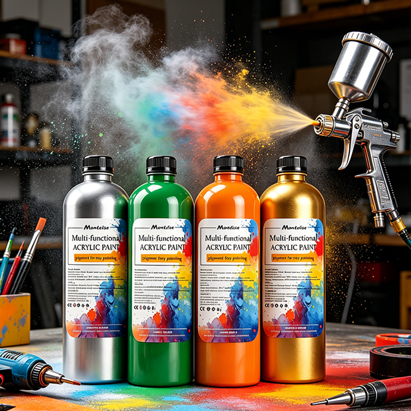 Sprayable Acrylic Paint
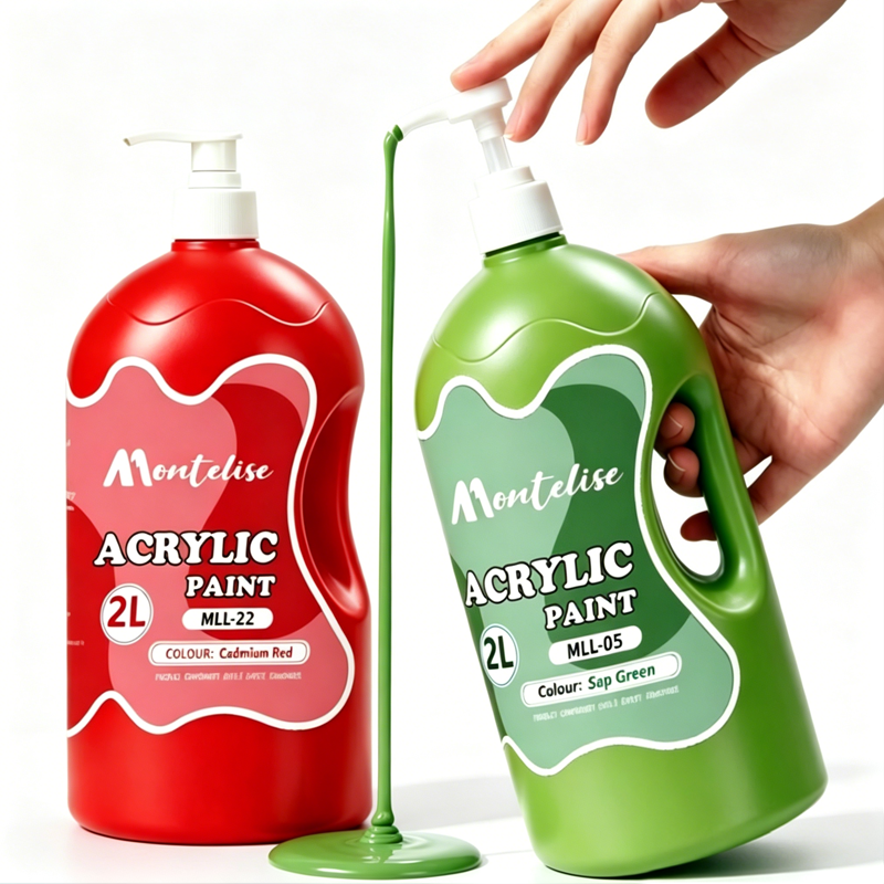 Bottled Acrylic Paint
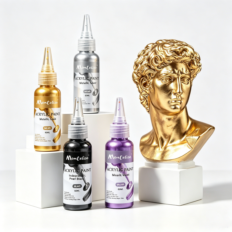 Metallic & Pearl Acrylic Paint